The Economist commodity dependency maps
A very short note indeed to point you in the direction of an interesting suite of maps courtesy of those full time non-Christmas-break-taking pros over at The Economist, who've produced a wonderful set of infographics on commodity dependency.
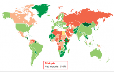
Summarising countries' commodity dependency, 2010-13 average, by % of GDP, the maps cover import/export commodities, oil, metals and foods. From the article:
BETWEEN 2000 and 2011 broad indices of commodity prices tripled, easily outpacing global growth. Since then prices have changed course. Some commodities have endured ferocious price falls: oil peaked at $115 a barrel in June, and by early December was trading at around $70 a barrel. Such reversals are naturally much better news for net importers of resources than for net exporters. Producing countries, many of which are relatively poor, suffer when prices drop. Our interactive maps display data from the UN Conference on Trade and Development, and show which countries are net importers and exports of primary commodities in general, and of oil, metals and food in particular.
As with all data, there are caveats. Prices affect the numbers: when commodities are expensive, they will account for a larger share of exports and imports. Some producing economies managed the gains from the good times better than others: they have much bigger reserves to cope with falls in prices. That said, the map does suggest which economies, from copper-producing Chile to oil-rich Angola, are most vulnerable to a downward lurch in the commodity cycle.
ENDS